
The project dashboard
Every project board carries its own analytics rail: no separate reporting tool, no export-to-spreadsheet step. The rail lives to the right of the board and updates as the team works.
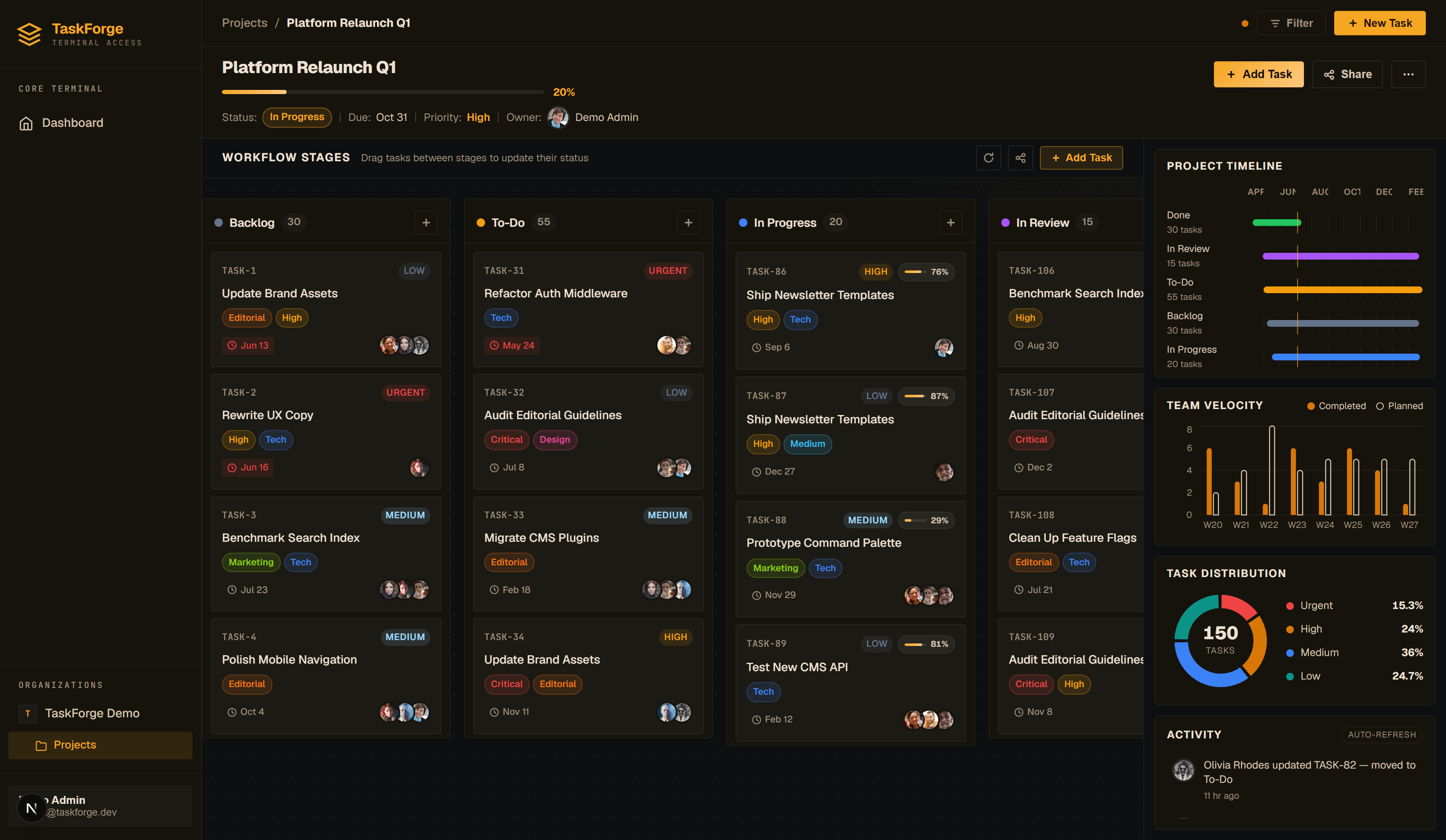
Timeline
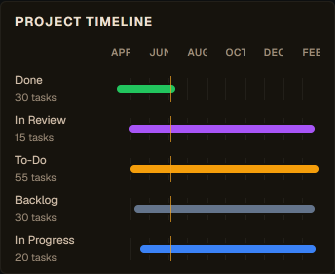
A Gantt-style view of the project's tasks. Each bar spans the task's start date to due date; the fill level shows its progress, and the color tracks its column. A "today" marker runs down the chart so you can see at a glance what should be in flight.
Tasks without dates don't appear here. If the timeline looks sparse, add start and due dates to your tasks in the detail view.
Team velocity
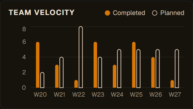
Tasks completed per week (solid bars) against tasks planned for that week (outlined bars). "Completed" means moved into a terminal column like Done; "planned" counts tasks whose due date fell in that week. When the solid bars keep up with the outlines, the team is on pace.
Task distribution
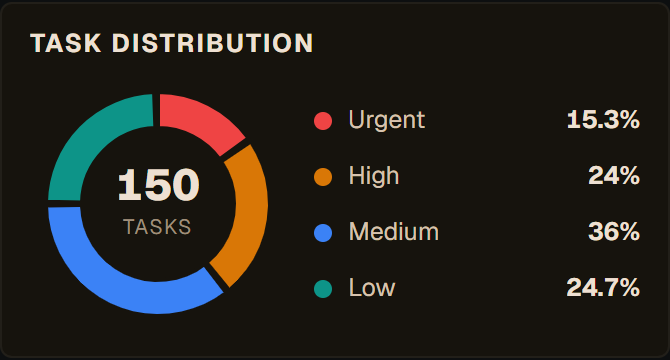
A donut of open work by priority: Urgent, High, Medium, Low. Its job is early warning: if the Urgent/High share grows week over week, scope is outrunning the team.
Activity feed
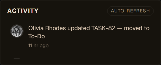
A human-readable stream of everything happening in the project: cards created, moved, completed, assigned, relabeled. It refreshes itself about every 30 seconds, so a board left open on a wall display stays current.
The project header
The header above the board is part of the same story:
- Progress bar: share of tasks in terminal columns (or the manual override, if the project sets one)
- Days-left chip: countdown to the project due date
- Status & priority badges: the project-level settings
- Team avatars: everyone with work on this board
Feeding the dashboard
The rail is only as good as the task data behind it. Three habits keep it honest:
- Date your tasks: start and due dates power the timeline and the "planned" velocity series.
- Use terminal columns properly: only move a card to Done when it's done; that single signal drives progress, velocity and the timeline's completion state.
- Keep priorities current: the donut is a triage tool, not a decoration.
Empty charts on a new project?
That's expected. Velocity needs a week or two of history and the timeline needs dated tasks. To see the dashboard fully lit, log into the demo project, which ships with months of activity.